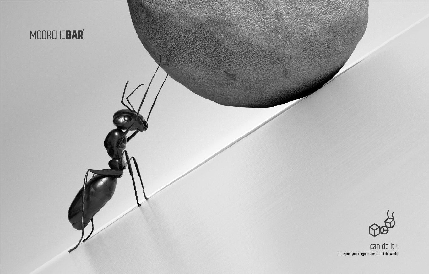
MoorcheBar operates as a business in the transportation industry to help small exports. The main idea was taken from the title of the brand name (Ant) and also the packaging. In the logotype, the word (bar) which means cargo is thicker than the word (moorche) which means ant, which is to pay attention to the importance of the approach as well as a reference to the potential of the collection.
–
Combining the main geometric shapes (cube) as a symbol of the cargo and finally using the image of a wheelbarrow as the main symbol of the transportation industry, we reached the image of an ant.