Simrod Sama Company with three decades of valuable experience in aluminum, cable manufacturing, deoxygenation products in the steel industry since 1996 with a production capacity of 65,000 tons per year located 45 km from Tehran to Semnan on a land area of 35,000 square meters Launched and launched its products to domestic and foreign markets. Ability to produce all kinds of pure aluminum wires and alloys required by various industries and types of deoxygenators in the steel industry in accordance with national and international standards and to meet customer demands, committed to continuous improvement and belief in the effectiveness of quality management system in improving productivity. Simrod Sama succeeded in obtaining and establishing the international standard certificate ISO 9001 – 2015 and the certificate 17025, and also significantly improved the activities of the complex by establishing a quality management system.
Brand Values
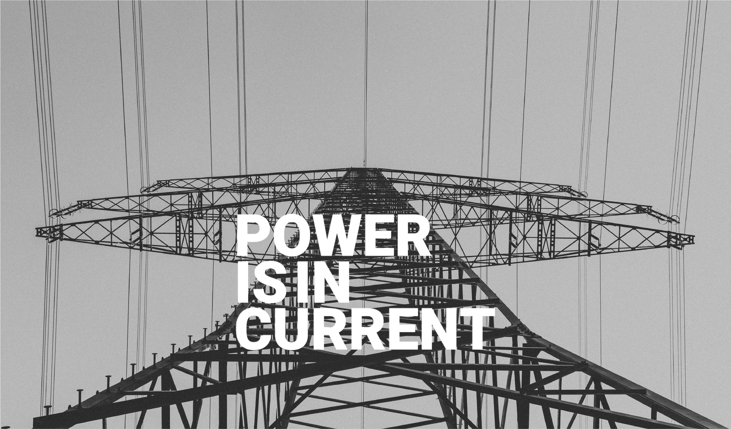
are an essential part of a strong brand. They are the core values that the company believes in and upholds. A strong sense of brand values creates morale in the company and increases brand loyalty. According to the above definition and the background and approach of Simrod Sama Company, the decision was made to redesign the logo and visual identity. The following keywords are related to the values of Simrod brand:
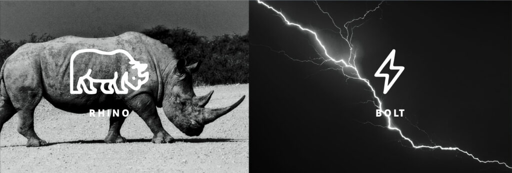
Simrod Logo Concept
SIMROD COLORS
Yellow: (Attention-grabbing) Since yellow is the most visible color, it is also the most attention-getting color. Yellow can be used in a small amount to draw notice. Black: The color black is associated with a number of positive qualities and characteristics.
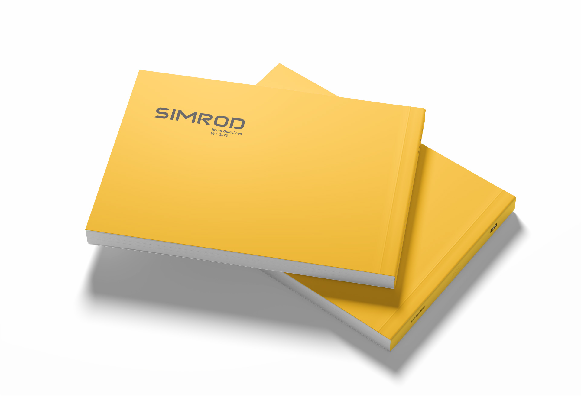
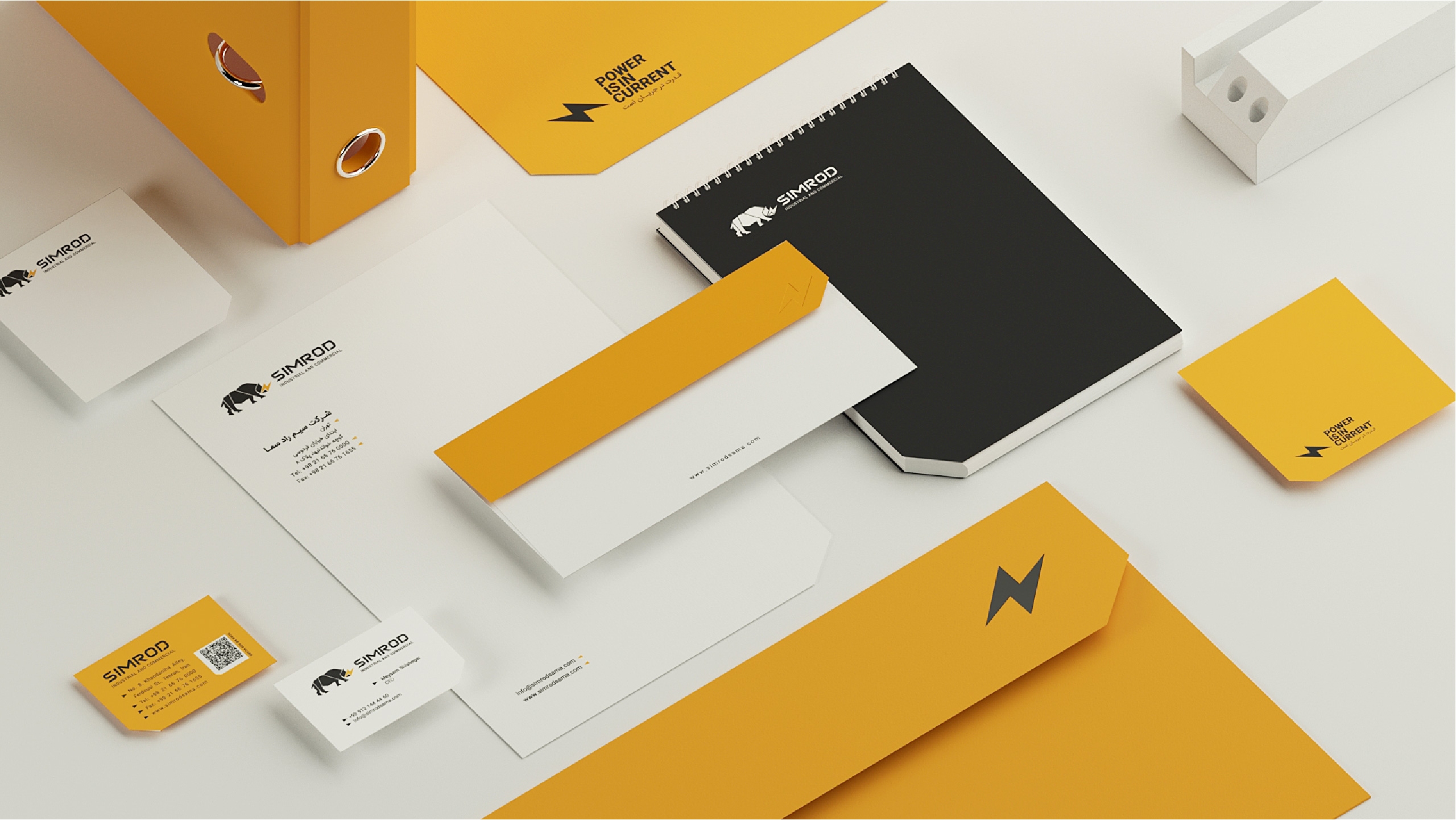
SIMROD BRANDBOOK
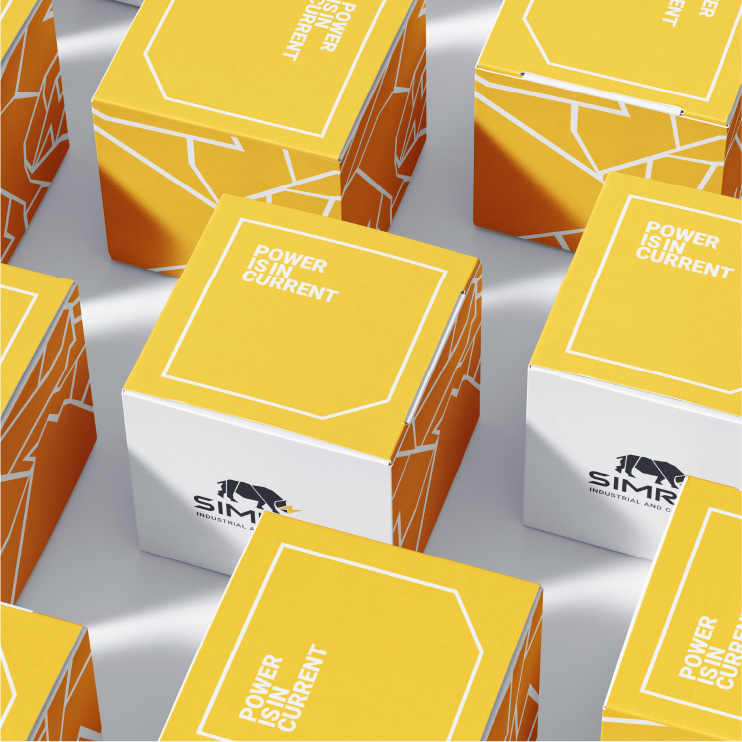
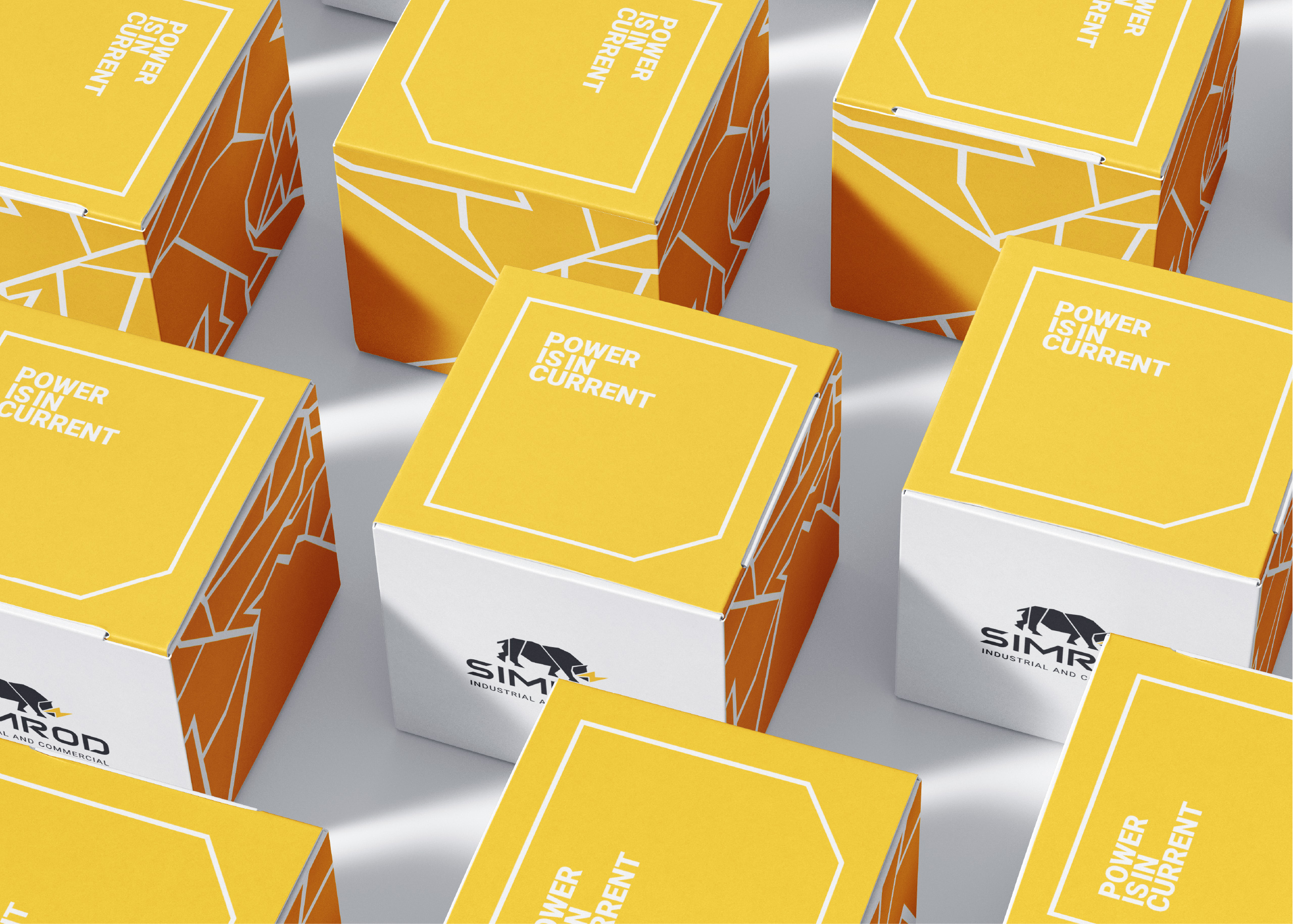
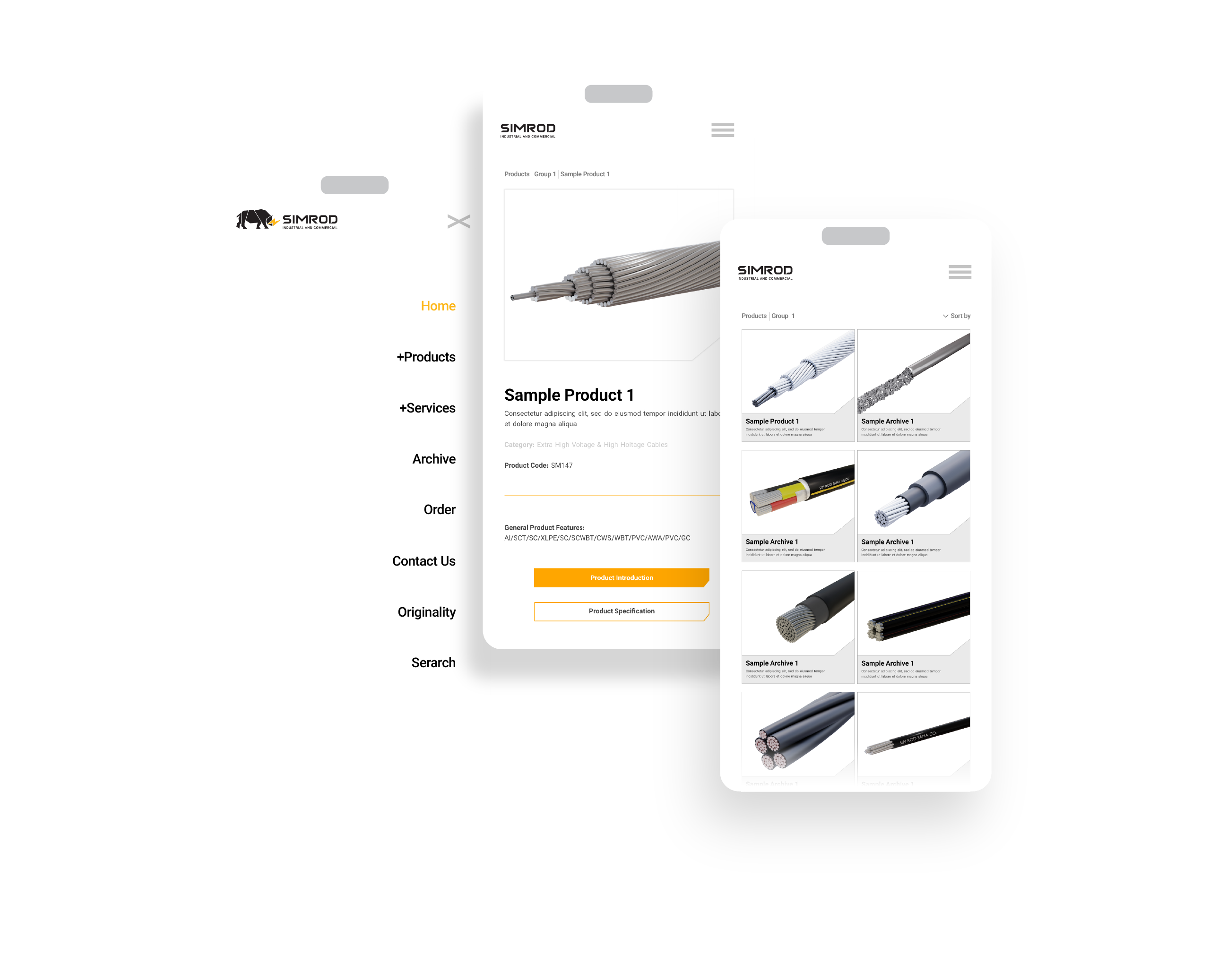
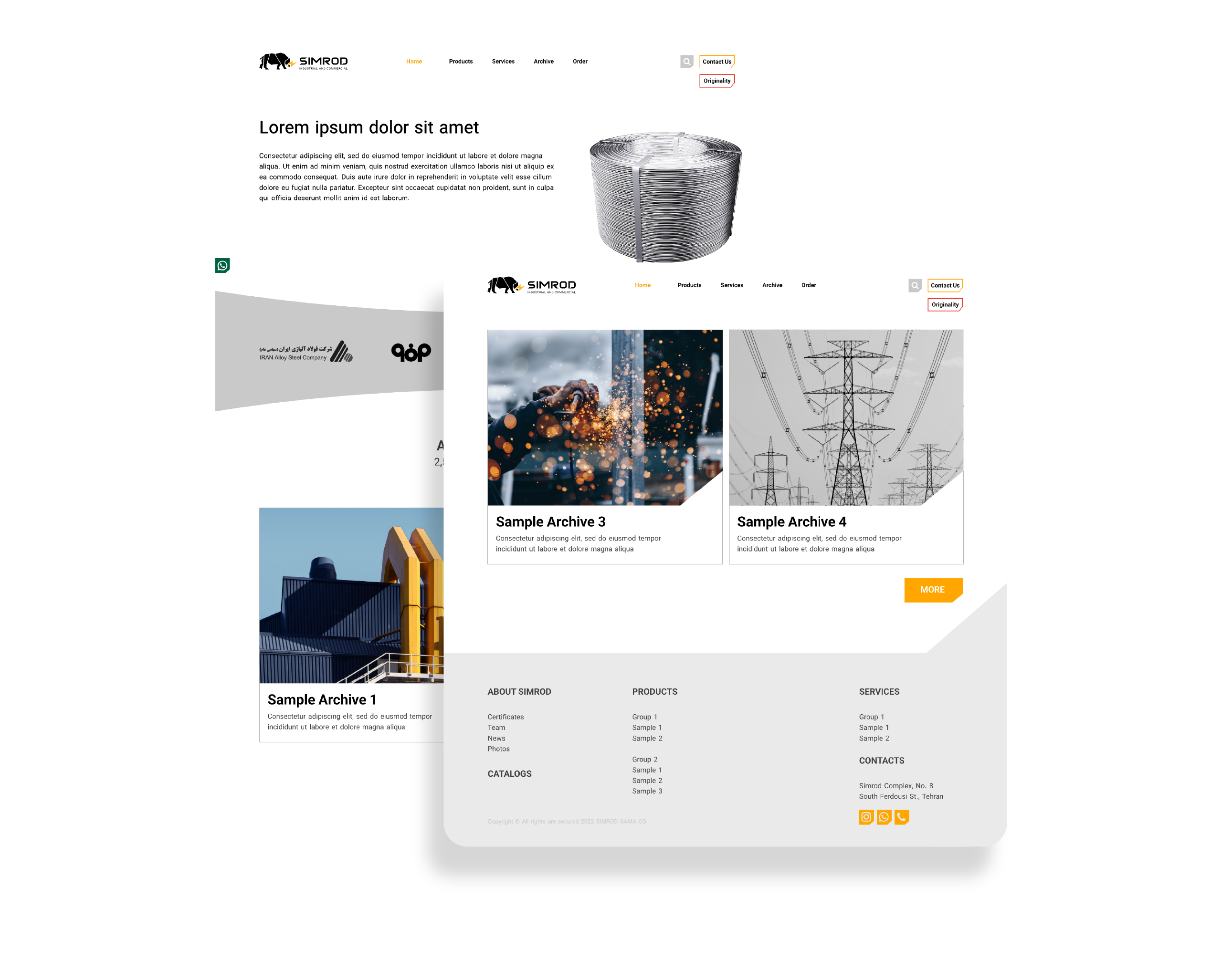
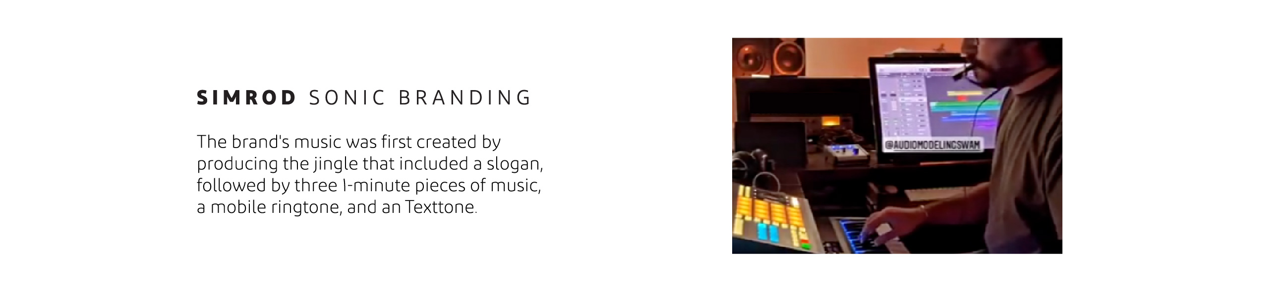
This project began approximately in 2022, with the first step being the redesign of the company’s logo. After that, we developed the brand book, covering sections such as brand strategy, logo usage guidelines, design system, stationery set, promotional materials, apparel and internal goods, environmental graphics, imagery and style guides, presentation methods, icons, logo motion, brand sound and music, website, social media graphics, packaging, and exhibition graphics.
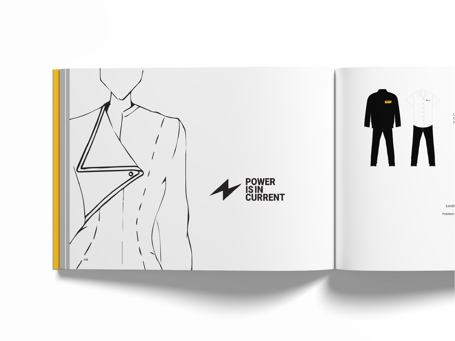
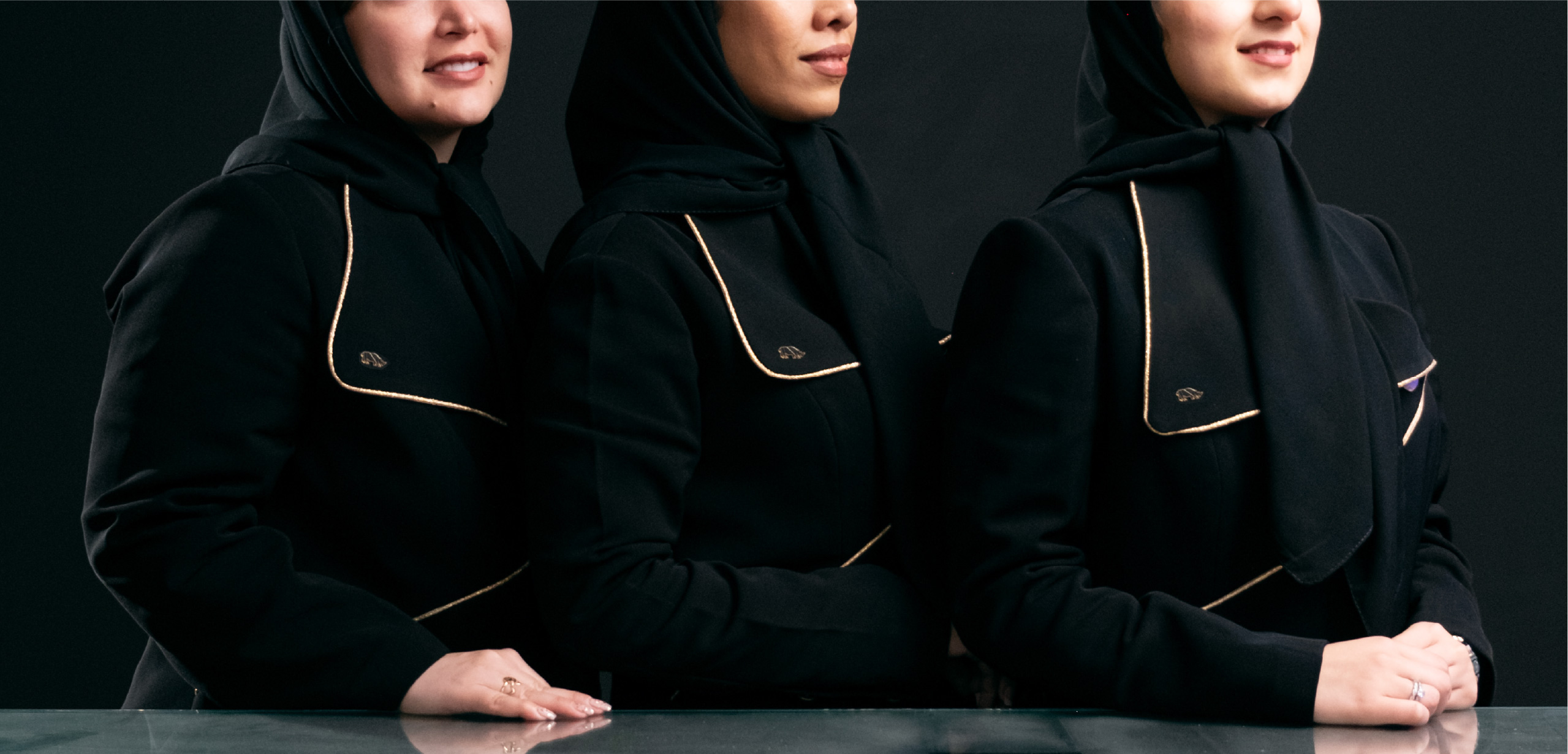
For women’s uniforms to participate in the exhibition, a collar model with the format of the main element of the logo is used. The main color of the fabric is black and the edge of the collar is yellow or golden.
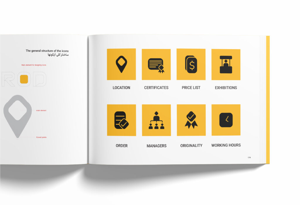
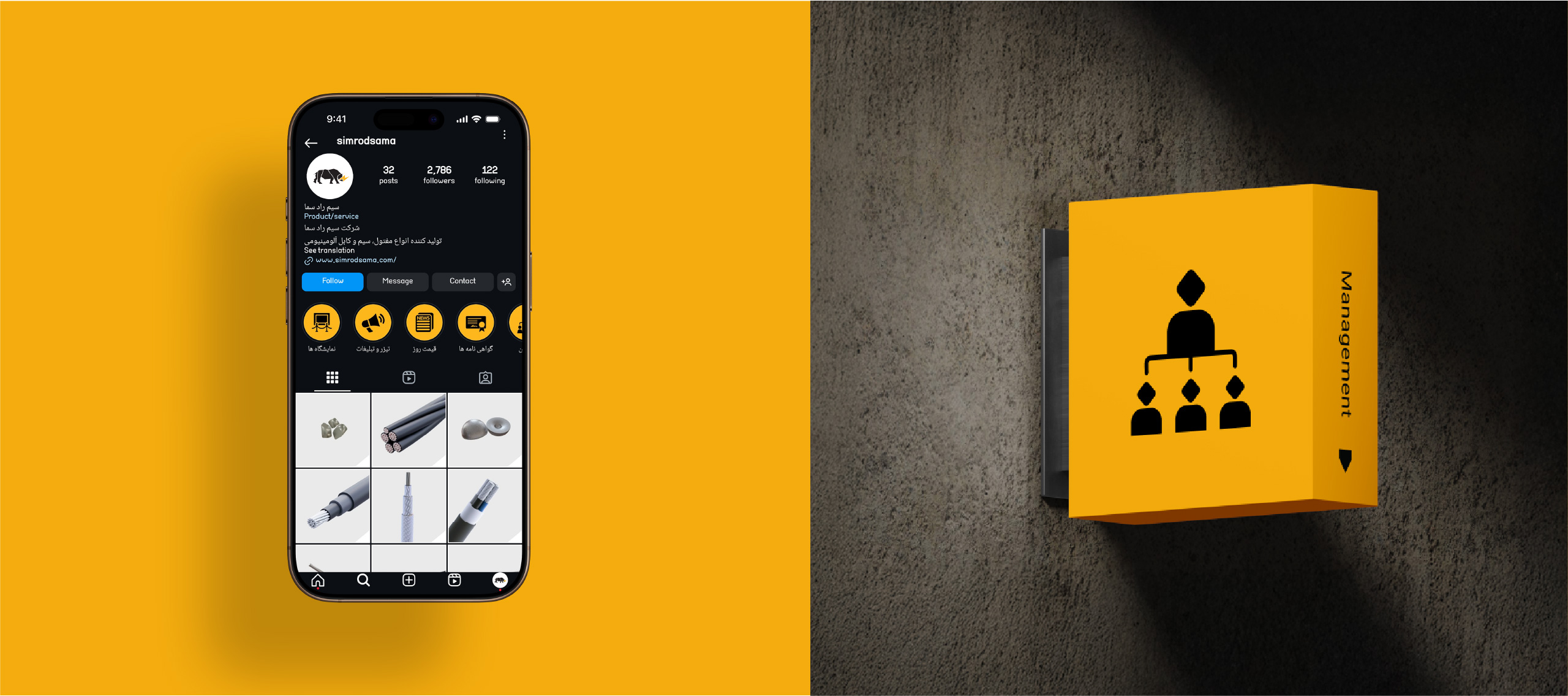
SIMROD PICTOGRAMS
Icons were designed using the geometric structure of the English logotype.
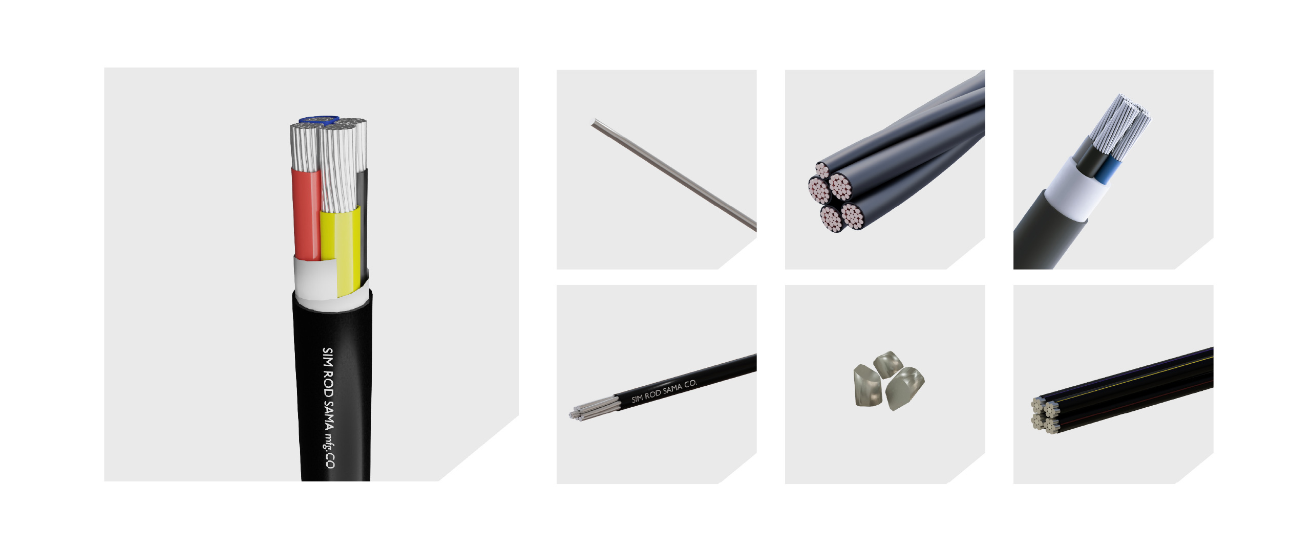
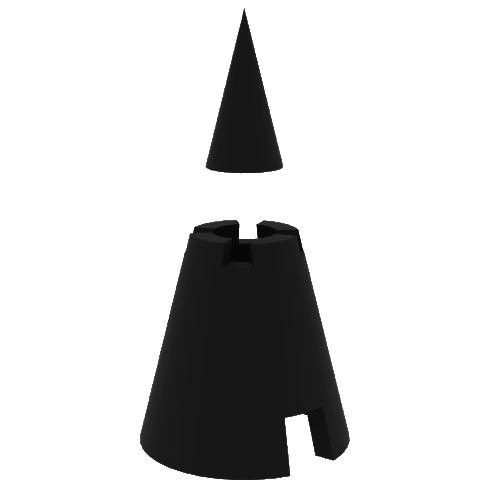
Products 3d modeling
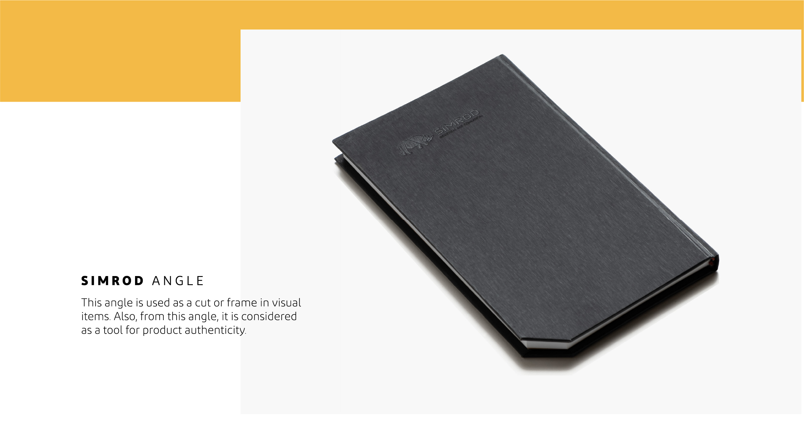
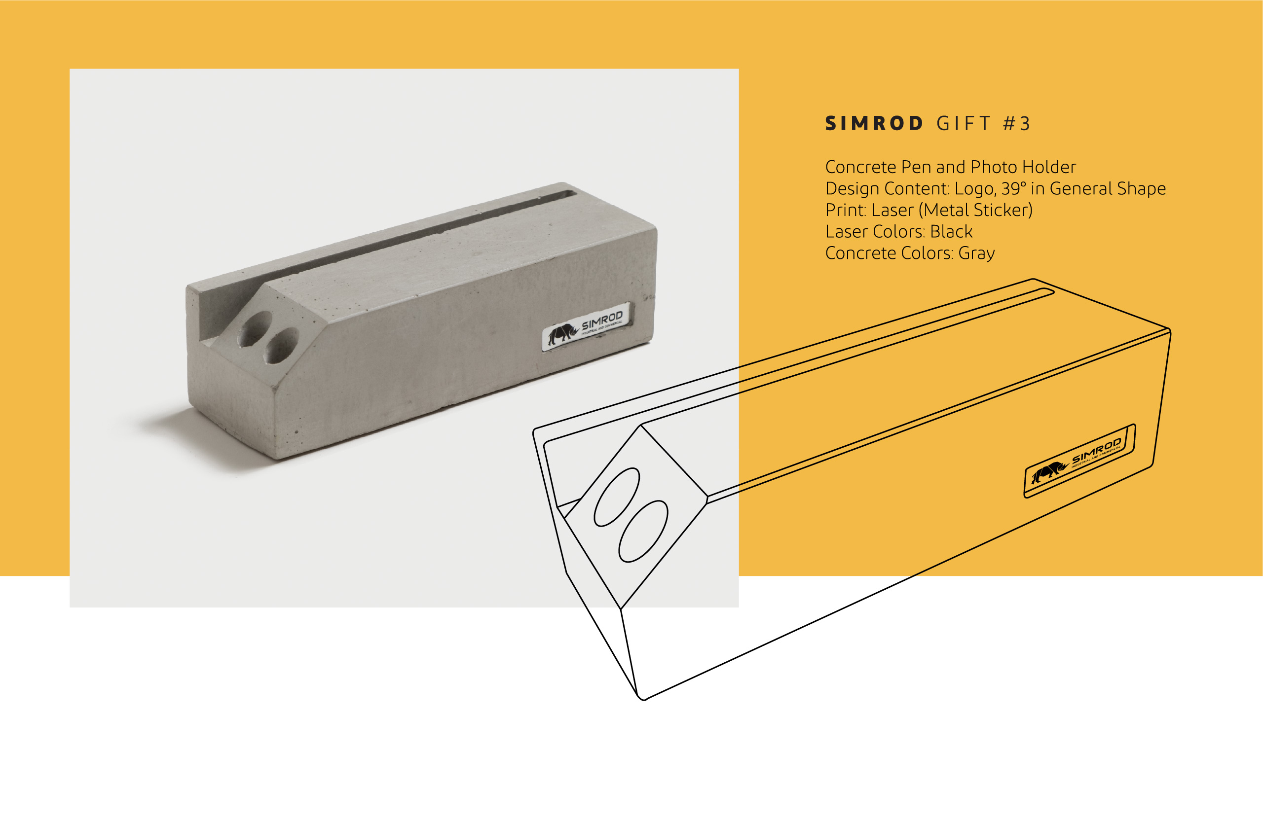
* Product visualization is done by Autodesk 3ds Max software. In most of the illustrations, the products are arranged according to Simrod angle.
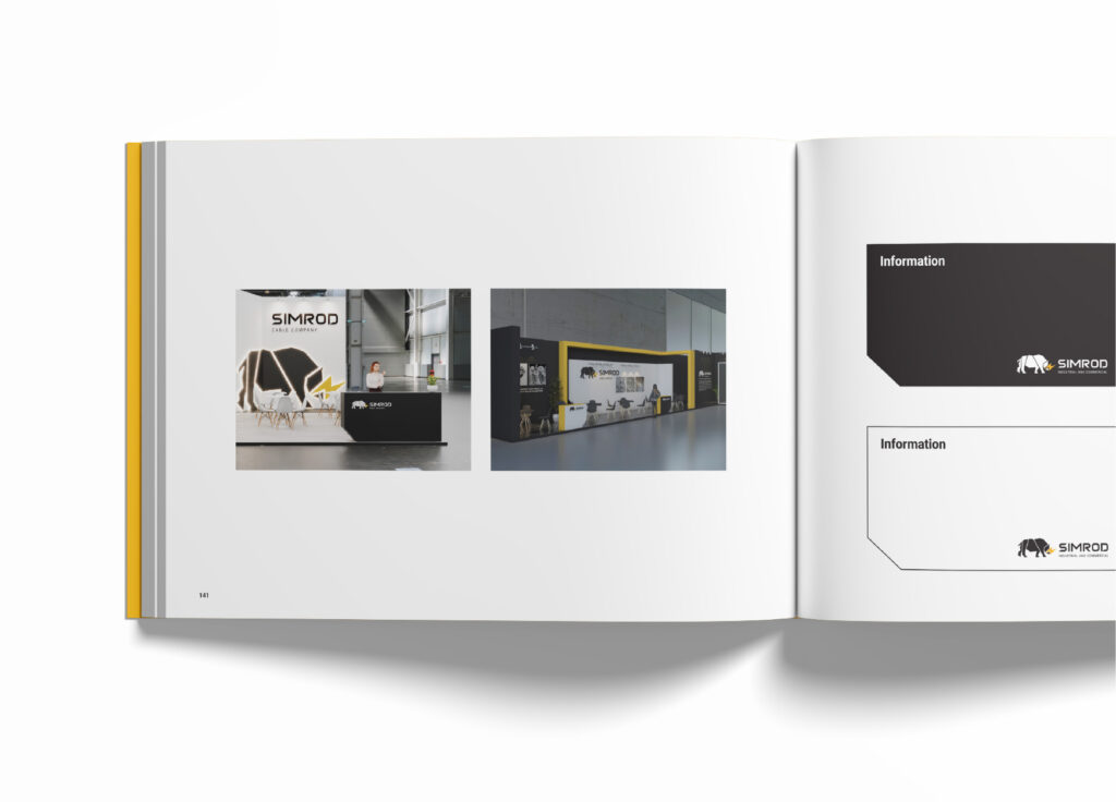
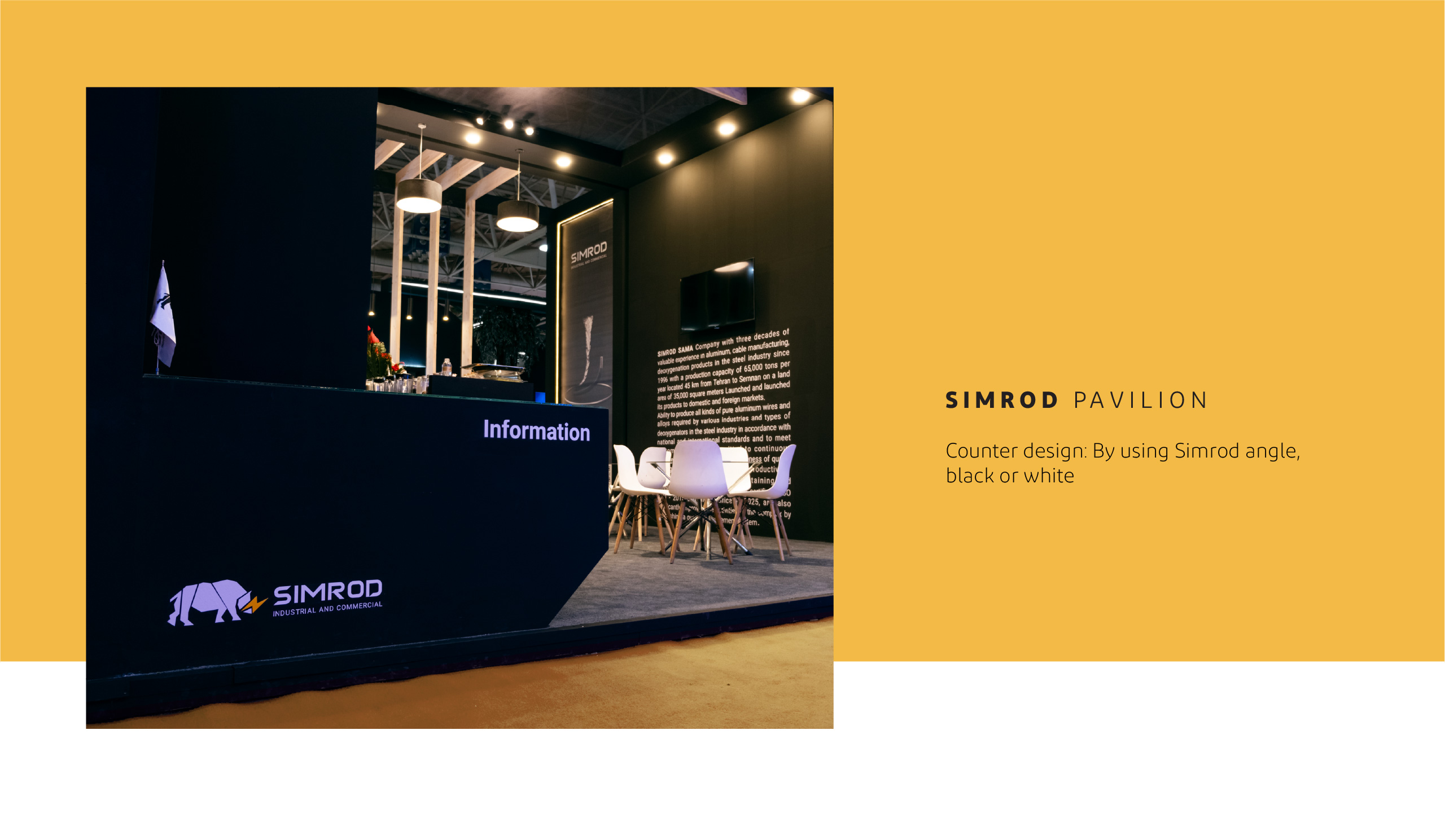
SIMROD EXHIBITIONS
All exhibition items were designed with a visual identity, a 39-degree angle, and a defined color scheme. There are only differences in the overall structure of the booth depending on the exhibition approach and audience. The design was managed by Hooej Studio.
International Visual Identity Awards and Winning First Place
Hoodej Studio has secured first place at the 2024 Visual Identity Awards…
Hoodej Studio successfully won first place at the 2024 Visual Identity Awards. We participated in this competition by presenting the logo and brand book of Simrod Company.
This project began approximately two years ago, with the first step being the redesign of the company’s logo. After that, we developed the brand book, covering sections such as brand strategy, logo usage guidelines, design system, stationery set, promotional materials, apparel and internal goods, environmental graphics, imagery and style guides, presentation methods, icons, logo motion, brand sound and music, website, social media graphics, packaging, and exhibition graphics.